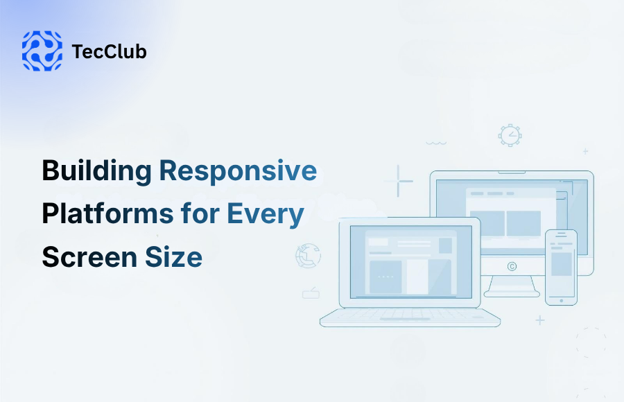
People don’t use just one device anymore.
A customer might discover your business on their phone during a lunch break, check your services later on a tablet, and finally make a purchase from a laptop that evening. Sometimes they switch between devices multiple times in the same day—and they expect everything to feel smooth every time.
That’s exactly why responsive design matters so much today.
At TecClub Technology, we build digital platforms that feel natural on every screen—whether someone is browsing on a smartphone, working from a desktop, or opening your platform on a tablet. The goal isn’t simply to “fit” different screens. It’s to create an experience that feels fast, comfortable, and easy to use wherever your users are.
What Does a Responsive Platform Actually Mean?
A responsive platform automatically adjusts based on the screen it’s being viewed on.
That includes things like:
- Layout and page structure
- Menus and navigation
- Buttons and spacing
- Images and media
- Text size and readability
In simple words: your platform should feel right no matter what device someone is using.
Users shouldn’t have to zoom in, struggle to click buttons, or deal with broken layouts just to use your website or app.
It should feel effortless.
Why Responsive Design Matters More Than Ever
People expect digital products to work instantly and smoothly.
If a website looks perfect on desktop but feels frustrating on mobile, most users won’t wait around—they’ll leave.
And that affects more than just user experience.
A poor mobile experience can hurt:
- Customer trust
- Engagement
- Conversion rates
- Search visibility
- Long-term retention
A responsive platform helps businesses avoid that friction and create a stronger experience from the very first click.
Mobile Experience Comes First
For many businesses, mobile is where most visitors arrive first.
That first experience matters.
When someone visits from their phone, they should be able to:
- Read content easily
- Navigate without confusion
- Tap buttons comfortably
- Complete forms quickly
- Move through the platform without delays
A strong mobile experience feels simple—and simple experiences convert better.
A Familiar Experience Across Every Device
People switch between devices constantly.
Phone. Tablet. Laptop. Back to mobile.
A responsive platform helps everything feel connected.
That means:
- The same branding everywhere
- Familiar navigation on every screen
- Smooth transitions between devices
- A consistent overall experience
Users don’t have to “relearn” the platform depending on where they open it.
That consistency builds trust.
Performance Matters Too
Responsive design isn’t only about layout.
Speed matters just as much.
A platform should feel quick whether it’s opened on a powerful desktop or a phone using slower mobile data.
That means optimizing:
- Images for different screen sizes
- Page loading speed
- Touch interactions
- Layout rendering
- Media delivery
When everything loads fast and responds smoothly, people stay engaged longer.
Better SEO and Visibility
Responsive design also helps with discoverability.
Search engines pay close attention to mobile experience and performance.
A responsive platform often supports stronger SEO through:
- Better mobile usability
- Faster load times
- Improved engagement
- Better performance scores
- Lower bounce rates
Good user experience and better search visibility often go hand in hand.
Easier to Manage Long-Term
Managing separate desktop and mobile versions can become complicated very quickly.
Responsive development keeps things simpler.
With one flexible platform, businesses can:
- Update faster
- Test more efficiently
- Maintain one codebase
- Launch improvements with less overhead
That saves time and makes long-term growth much easier.
Designing for Real Interaction
Different devices are used differently.
Desktop users click.
Mobile users tap, scroll, and swipe.
Tablet users often do a mix of both.
That changes how we design things like:
- Button sizes
- Spacing between elements
- Navigation menus
- Touch-friendly interactions
- Content layout
Small details make a big difference.
A platform feels better when it matches how people naturally interact with their device.
Building for the Future
Screen sizes keep changing.
Today it might be:
- Smartphones
- Tablets
- Laptops
- Large desktop monitors
Tomorrow it could include:
- Foldable devices
- Ultra-wide displays
- New screen formats we haven’t even seen yet
Responsive architecture makes it easier to adapt as technology changes.
That flexibility matters for long-term business growth.
How We Build Responsive Platforms at TecClub Technology
At TecClub Technology, we focus on building platforms that feel smooth everywhere.
That includes:
- Mobile-first design
- Flexible UI systems
- Cross-platform frontend development
- Performance optimization
- Real-world testing across devices
We pay attention to both the visible experience and the technical side behind it—because great platforms need both.
Our goal is simple:
Build digital products that feel fast, easy to use, and consistent—no matter where users open them.
Final Thoughts
A responsive platform isn’t just about making things “fit” smaller screens.
It’s about creating an experience that feels natural everywhere.
When users can move from phone to tablet to desktop without friction, everything feels easier—and that creates better engagement, stronger trust, and better results for the business.
At TecClub Technology, we build responsive platforms designed around real users and real devices—so every interaction feels smooth, familiar, and ready for wherever your audience connects next.