How to Design a VPN App UI That Actually Builds Trust
When people download a VPN, they’re not just installing another app — they’re handing you the keys to their privacy. And here’s the thing: no matter how strong your encryption is, if the app feels sketchy or confusing, users won’t stick around.
That’s why design matters. A VPN’s UI is often the first signal of trust. A clean, clear, and approachable interface says, “We’ve got you covered.” A cluttered, jargon-filled mess says the opposite.
So, how do you design a VPN app that not only works well but also makes users feel safe and confident? Let’s break it down.
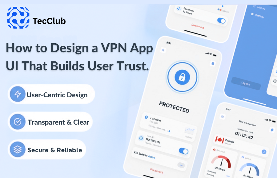
1. Keep It Dead Simple
Most people use a VPN for one reason: to connect securely. They don’t want to dig through menus or learn new technical terms.
-
Put a big, obvious Connect/Disconnect button front and center.
-
Use labels people understand — “Fastest Server” or “Closest Location” instead of protocol names.
-
Make sure someone can connect in just one or two taps.
Simplicity communicates honesty. If it feels easy, it feels trustworthy.
2. Be Upfront and Transparent
VPN users value clarity. If your app hides behind vague claims like “total security guaranteed”, people get suspicious.
Show, don’t just tell:
-
Use a clear status indicator: Connected vs Not Connected.
-
Explain features like Kill Switch or Auto-Connect in short, plain language.
-
Use onboarding screens or quick tooltips to guide new users without overwhelming them.
When people understand what’s happening in the background, they feel more in control — and that builds confidence.
3. Lean on Familiar Visuals
Design isn’t just about looking nice. It’s about sending signals. Simple cues like shields, locks, or connection lines instantly tell users, “This is secure.”
-
Show servers on a world map or with easy pins.
-
Use intuitive colors: green = safe, red = disconnected, gray/blue = neutral.
-
Keep your design consistent so users know what to expect across the app.
These little touches make the experience feel reassuring instead of uncertain.
4. Give Real-Time Feedback
Nothing kills trust like doubt. If users aren’t sure whether the VPN is doing its job, they’ll quit using it.
-
Show live connection status: connected, reconnecting, or disconnected.
-
Display server load or ping times so users can see performance at a glance.
-
Notify them if the app reconnects after a drop in Wi-Fi.
This transparency makes users feel like your app is actively working for them, not against them.
5. Make Security Features Accessible
Some users want advanced controls, but burying them in complicated menus just frustrates people.
-
Keep essentials like Kill Switch and Auto-Connect in one easy-to-find place.
-
Swap technical protocol names for simple explanations (e.g., “High Security Mode”).
-
Set strong default settings so beginners don’t have to tweak anything.
Strong security shouldn’t mean a steep learning curve.
6. Stay Consistent Across Devices
Most people switch between phone, laptop, and tablet. If your VPN feels totally different on each platform, it creates friction.
Consistency builds familiarity — and familiarity builds trust.
Wrapping It Up
A VPN app’s design isn’t just about aesthetics. It’s about trust. Every tap, icon, and label tells users whether they can rely on you to protect their privacy.
In today’s crowded VPN market, the services that win won’t just be the ones with the toughest encryption. They’ll be the ones that users feel confident opening every single day.
👉 Quick VPN UI Trust Checklist
-
Big, simple connect button
-
Clear status indicators
-
Familiar visuals (shields, locks, maps)
-
Real-time performance feedback
-
Plain-language feature explanations